This article was originally published on WLT Report. You can read the original article HERE
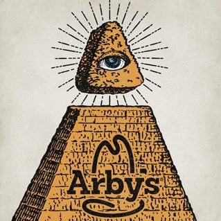
Why did Arby’s just go full New World Order on Twitter and change their profile picture to the All Seeing Eye of Horus?
Plus the Pyramids….
Plus just about every esoteric and evil symbology you can think of?
It looks like this:

And this:
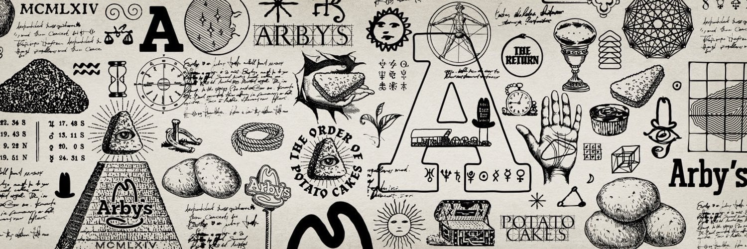
People are definitely taking notice:
🔥🚨DEVELOPING: Arby’s fast food restaurant just changed their profile picture to the occult All Seeing Eye pyramid without any official announcement on the change. pic.twitter.com/qKA9wr93oN
— Dom Lucre | Breaker of Narratives (@dom_lucre) June 30, 2024
They also started posting “The End Is Near” all over the place.
Like this:
What is going on over on Arby's X account?
The cryptic video with "The Return is Near" now appears on their rebrand page – it kind of looks Egyptian-themed?
I didn't know they were still in business, to be honest…pic.twitter.com/MjYrFZKahT
— Mario Nawfal (@MarioNawfal) June 30, 2024
This:
It’s happening. pic.twitter.com/JZeIfrxdmx
— Arby's (@Arbys) June 29, 2024
This:
Uhhhhmmmm? pic.twitter.com/OAiHaBvnR4
— Arby's (@Arbys) June 27, 2024
And this:
Not only did Arby's change their profile picture to an all-seeing eye, but they also uploaded a bizarre video of a pyramid with a clear message saying, "The Return Is Near."
The return of who? pic.twitter.com/7t0pcAriWi
— Shadow of Ezra (@ShadowofEzra) June 30, 2024
Oh, and of course the Pyramid.
LOTS of pyramids:
It’s happening. pic.twitter.com/JZeIfrxdmx
— Arby's (@Arbys) June 29, 2024
So….what’s going on?
Is Arby’s now run by Freemasons?
Has Arby’s been a shadow corporation all along designed to hide Government secrets in plain site?
Ehhhhh, most likely not.
Sorry folks, I think this is a case of nothing more than a brilliant ad campaign.
While the exact punchline of the ad has not been revealed yet, my guess is they are bringing back an old menu item that was a fan favorite — maybe potato wedges?
Or perhaps a new item to soon be announced.
I’m sure we will see in the coming days….
Or they’ve just gone full New World Order.
We’ll keep you updated!
RELATED:
While I think this is just a creative ad campaign, it’s not a joke that symbolism *IS* often hidden in plain sight.
Like this:
UPDATE: The Truth Behind The NVIDIA Name and Logo? 666 Hidden In Plain Sight!
UPDATE: The Truth Behind The NVIDIA Name and Logo? 666 Hidden In Plain Sight!
You people are amazing...
A couple days ago, I brought you this report:
In it, I broke down all the occult symbolism in the NVIDIA name and logo.
I'll republish that full report down below in case you missed it, but you might already notice a few things just looking at it....
Like the fact that the logo seems to be a combination of the Pedo-Boy-Lover image and the Eye of Horus (gee, what a nice mashup)!
But one of you emailed me to say I missed the most obvious....the 666 hidden right in the logo.
Why do they always do this?
Just another coincidence that that darned 666 just showed up again in a logo for the biggest company on the face of the Earth.
Can you see it?
How about if I draw them out for you:

So weird how that just keeps popping up everywhere.
Keep reading and I'll show you dozens of more examples, as well as an explanation for what the name NVIDIA might be code for.
It's all below in my original report:
The Truth Behind The NVIDIA Name and Logo?
This is pretty wild....
A couple days ago, I posted this question to Twitter:
NVIDIA
Hidden in plain sight
What do you notice about that logo? pic.twitter.com/19P0AyEOxe
— DailyNoah.com (@DailyNoahNews) June 17, 2024
I was curious to see what everyone would see...
I mean, it's a strange name isn't it?
NVIDIA?
Why would anyone ever choose that weird name?
No one even knows how to pronounce it.
Unless...it was a coded message hidden in plain sight?
Then a couple days later I gave the full explanation:
What do you notice about this?
First of all, the logo seems to be a combo of the "boy-lover" pedo symbol combined with the Eye of Horus.
Second, the light/dark symmetry is prime occult symbology.
But here's where it gets wild....
NVIDIA was created in 1993, LONG before the AI revolution. It was started a simply a graphics card company.
But it just so happens (coincidence, right?) that the name spelled backwards is AI Divn. As in "AI Divine".
And what do these people think they're doing?
Creating a new AI "god".
Just a big coincidence, right?
What do you notice about this?
First of all, the logo seems to be a combo of the "boy-lover" pedo symbol combined with the Eye of Horus.
Second, the light/dark symmetry is prime occult symbology.
But here's where it gets wild....
NVIDIA was created in 1993, LONG before the… pic.twitter.com/lgPWfpaJWB
— DailyNoah.com (@DailyNoahNews) June 21, 2024
How wild is that?
Decades before the AI revolution was even considered possible, NVIDIA named the company AI Divine in reverse?
What are the odds?
Just a random coincidence, I'm sure....
Nothing to see here!
Do NOT put on your tin-foil hat!
Oh, and did you know this week the value of NVIDIA surpassed the ENTIRE German Stock Exchange?
Just a random coincidence that the company trying to create our new "AI overlords" is suddenly the most valuable company on the planet.
Oh and they want to be your virtual doctor too:
Here come the AI nurses and doctors from NVIDIA.... pic.twitter.com/ZzxrmEfrP4
— DailyNoah.com (@DailyNoahNews) March 20, 2024
Would you trust that?
But now let's dig deeper into Logos and Names and how they constantly hide the 666 and other occult symbology in their names and logos:
THREADS: Why Do They Love 666 So Much?
Why do "they" love 666 so much?
I think it's pretty obvious, the Bible tells us why.
But perhaps you haven't seen or noticed.
They always hide these things "in plain sight".
Ready for me to pull back the veil?
Let's start with some you may have missed...
How about Disney for starters:
Disney 666 logo: pic.twitter.com/A98hkRHjZ3
— DailyNoah.com (@DailyNoahNews) July 9, 2023
Now do you see why that font was chosen?
It always bothered me that the "y" was so goofy, but now you know why....they needed to get the last 6 in there!
How about Google Chrome...
Ever noticed this?
Chrome 666 logo: pic.twitter.com/uUlPpvtCJh
— DailyNoah.com (@DailyNoahNews) July 9, 2023
Hidden in plain sight!
They love that design.
How about our friends over at the World Economic Forum.
No surprise here:
WEF 666 logo: pic.twitter.com/QfszMTgs3F
— DailyNoah.com (@DailyNoahNews) July 9, 2023
Just had to draw the line right through the 0's didn't they?
Of course.
Gives you three perfect sixes!
Here's another one that should be no surprise: CERN:
CERN 666 logo: pic.twitter.com/tEy8mqVePh
— DailyNoah.com (@DailyNoahNews) July 9, 2023
I don't even need to highlight those three sixes, they are very obvious.
And then we have the new Facebook/Meta Threads.
Toxic from the jump, of course the logo is full of sixes!
Threads 666 logo: pic.twitter.com/VC6e19H0qK
— DailyNoah.com (@DailyNoahNews) July 9, 2023
Here's an alternate way of counting:
Threads 666 logo: pic.twitter.com/H3k2QPP9oZ
— DailyNoah.com (@DailyNoahNews) July 9, 2023
I agree with Catturd:
This is the dumbest 666 looking logo in history.
Seriously, lol, who’s the dumbass who thought this was a good idea? 😂 it sucks. pic.twitter.com/4XOs6WHyIH
— Catturd ™ (@catturd2) July 7, 2023
And Kim Dotcom:
How to put 666 ‘the number of the beast’ into a logo. pic.twitter.com/ITsUPFK78V
— Kim Dotcom (@KimDotcom) July 7, 2023
Meanwhile, according to GizChina, they claim the logo is so "inspiring" -- give me a break:
THE THREADS LOGO
Before we discuss what Mosseri said about the Thread logo, let us take a look at what the Threads logo is. The Threads logo is a simple design that consists of a circle with a vertical line running through it. At first glance, the logo looks like an “@” symbol, but it is not exactly an “@” symbol. The logo is realized in Instagram’s sans serif font, which gives it a modern and sleek look.
MEANING & INSPIRATION OF THE THREADS LOGO
Yesterday, Mosseri published a post on Threads introducing the meaning of the Threads Logo. He said that Threads’ Logo is derived from the classic Internet symbol “@”, which represents a person’s username, individual independence and voice. The logo interprets “@” as an unbroken line, inspired by the loop that occurs when a thread starts. This meaning of the logo is that when a Thread starts, it continues as a loop.
The logo is realized in Instagram’s sans serif font, which gives it a modern and sleek look. Meta has stated that the Threads logo is inspired by the Tamil alphabet. The Tamil alphabet is a script that is used to write the Tamil language, which is spoken in India and Sri Lanka. The Tamil alphabet consists of 12 vowels and 18 consonants, and it is known for its unique and intricate letterforms.
It is worth mentioning that the lines of this Logo are not hand-painted by the artist, but are based on Instagram’s own font Instagram Sans. The entire font is designed in a shape between a circle and a square, which also makes the Threads Logo look It is a “somewhat square round body”.
Threads logo is based on the Tamil letter “ம” (ma). The letter “ம” is a consonant that is pronounced as “ma” in Tamil. The letterform of “ம” consists of a circle with a vertical line running through it. This is similar to the Threads logo. The Threads logo is a simplified version of the Tamil letter “ம”, which gives it a clean and modern look.
Here's more if you want to go on a deep dive...
Symbolism Will Be Their Downfall -- CONFRONTING The So-Called "Elites"!
Ever wonder why there's a pyramid with the top cut off on every U.S. dollar bill?
Or why famous people constantly cover one eye?
Or why they love to pose with their right hand inside their jacket?
And on and on it goes...
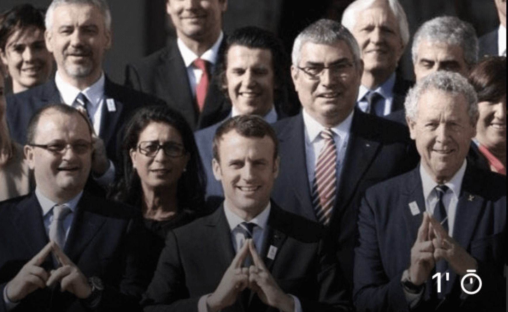
Sure, some of it could be coincidence, but how do you explain this one, with Macron in France recently?
Symbolism will be their down fall…The Cabal is real wake up….#NWO #GreatReset #Cabal #Resistance pic.twitter.com/6ENve3BFyA
— Isaac’s Army (@ReturnOfKappy) April 29, 2022
Nope, it's not edited...
Not fake...
Just a bunch of "elites" all posing together to make the Illuminati pyramid symbol.
Who does that?
WHY would you do that?
Symbolism will be their downfall.
And yes, that's exactly what it was:
If you need more than this to wake you up to what's going on, your brain dead, not asleep.
That is the hand sign of the Illuminati. pic.twitter.com/HaPNaUbVIM— 𝒲𝒾𝓁𝓁𝒾𝒶𝓂 𝒪𝒻 𝑀𝒶𝓇𝓎 🇨🇦 🇺🇸 (@fore_not_four) April 30, 2022
Another angle, still shot:
Very sinister indeed 🤣 pic.twitter.com/DMb7N3wGLs
— Rot van Rotterdam (@RotVanRotterdam) April 30, 2022
Oh, Tulsi....is that you?
She did attend Swaub’s workshop conference 😱 pic.twitter.com/roQvxNPWmH
— Les is More (@faulk_les) April 30, 2022
And then we have the Devil Horns....
Oh wait, I forgot, these people are all just big Texas Longhorn fans, right?
https://twitter.com/makerbreiz/status/1520685287185305600
And covering the one eye:
https://twitter.com/BennnetMaria/status/1520507892385861633
And here's Jacko doing the one eye:
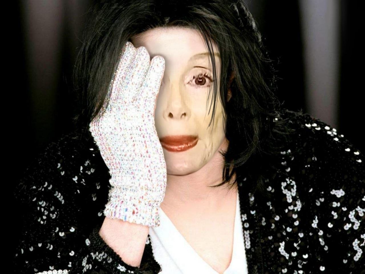
Who poses like that?
I mean, unless....it's a sign and symbol.
And whatever the hell this is:
https://twitter.com/makerbreiz/status/1520486218055790593
And how about Disney?
They above all else are STEEPED in these Satanic ritual symbols...
Here's just a few:
— conspiracybot (@conspiracyb0t) April 25, 2022
We've covered this topic many times before, so if you want more check out these articles where we dive deep:
And this:
And this:
WE INVESTIGATE: Suddenly The 2012 Olympics Opening Ceremony Makes a LOT More Sense….
And of course this:
This article was originally published by WLT Report. We only curate news from sources that align with the core values of our intended conservative audience. If you like the news you read here we encourage you to utilize the original sources for even more great news and opinions you can trust!




Comments