The macOS 15 Sequoia update will inevitably be known as "the AI one" in retrospect, introducing, as it does, the first wave of "Apple Intelligence" features.
That's funny because none of that stuff is actually ready for the 15.0 release that's coming out today. A lot of it is coming "later this fall" in the 15.1 update, which Apple has been testing entirely separately from the 15.0 betas for weeks now. Some of it won't be ready until after that—rumors say image generation won't be ready until the end of the year—but in any case, none of it is ready for public consumption yet.
But the AI-free 15.0 release does give us a chance to evaluate all of the non-AI additions to macOS this year. Apple Intelligence is sucking up a lot of the media oxygen, but in most other ways, this is a typical 2020s-era macOS release, with one or two headliners, several quality-of-life tweaks, and some sparsely documented under-the-hood stuff that will subtly change how you experience the operating system.
The AI-free version of the operating system is also the one that all users of the remaining Intel Macs will be using, since all of the Apple Intelligence features require Apple Silicon. Most of the Intel Macs that ran last year's Sonoma release will run Sequoia this year—the first time this has happened since 2019—but the difference between the same macOS version running on different CPUs will be wider than it has been. It's a clear indicator that the Intel Mac era is drawing to a close, even if support hasn't totally ended just yet.
As we wrote earlier this year, Sequoia is the rare modern macOS release that runs on most of the same Macs that could run last year's version. That includes the last couple of generations of Intel Macs, which may or may not be nearing the end of the line update-wise. Here's the full compatibility list:
2019 iMac and later
2020 MacBook Air and later (both Intel and Apple Silicon)
2018 MacBook Pro and later
2019 Mac Pro and later
2018 Mac mini and later
2017 iMac Pro
All Mac Studio models
For Intel Macs, the proto-Apple-Silicon T2 chip is still usually the cutoff. Exceptions include the 2019 iMac, which didn't come with a T2 for some reason, and the 2018/2019 model of the MacBook Air, which has a T2 but a low-voltage dual-core Intel CPU that no longer makes the cut for Sequoia. As usual, Apple isn't commenting on why specific Mac models do or do not make the cutoff.
The system requirements are good news for Intel Mac owners (and anyone who relies on OpenCore Legacy Patcher to keep their Mac updated or who is still clinging to a Hackintosh). If your Mac was already supported by macOS 14 Sonoma, it's probably capable of running Sequoia. If Apple dumped your Mac in an older macOS release, the workarounds that got macOS 14 running on it will likely continue to work in macOS 15.
Other system requirements, Apple Intelligence edition
Individual features in all of the post-Apple-Silicon macOS releases have had a few features that only work on Apple Silicon Macs, but Sequoia is the first where the flagship feature of the release—Apple Intelligence—requires an Apple SIlicon Mac. This comes down to the presence of the Neural Engine, also called a neural processing unit (NPU) in the Windows world; every Apple Silicon Mac chip from the M1 on up includes one, but older Intel CPUs and the Apple T2 do not.
Below, we've compiled a full list of all macOS features that have specific hardware requirements, including those from older macOS releases. Generally, if you have an M1 or better, there's nothing your Mac won't do, but there are a couple of other cutoffs for specific features.
New-to-Sequoia features that require Apple Silicon:
Apple Intelligence, including features that use on-device processing (like Image Playgrounds) and features that use cloud processing (like ChatGPT integration)
Live audio transcription in the Notes app
One new feature that requires either Apple Silicon or a Mac with an Apple T2, which excludes the 2019 iMac:
iPhone Mirroring
And features from previous macOS releases that require Apple Silicon:
Running iOS/iPadOS apps
Spatial Audio in FaceTime when using AirPods
The 3D globe and more detailed renderings of cities in Apple Maps
On-device voice dictation, with no Internet connection required and no time limit
Portrait Mode in FaceTime
Live Captions transcription in FaceTime or any other app
"Reference mode," which lets you use a 12.9-inch M1 or M2 iPad Pro or any M4 iPad Pro "as a secondary reference display" in Sidecar mode
Inserting emoji using voice dictation
Game mode, which limits background tasks and reduces Bluetooth latency when enabled
High-performance mode in the Screen Sharing app
Getting rid of the "Hey" in "Hey Siri"
Running games built with the Game Porting Toolkit
“Coming later this year,” also Apple Intelligence edition
In recent years, it has become standard practice for Apple to announce features at WWDC that aren't ready in time for the initial OS release in the fall. Usually, those features are ready in time for the x.1 or x.2 releases later in the fall and winter, though occasionally, we have to wait until spring to get everything that was initially announced.
The big missing piece here is Apple Intelligence, and even the macOS 15.1 update probably won't include all the Apple Intelligence stuff that has been announced. Once it does launch, it will come with a "beta" label for at least a while, one of a few words (along with "preview" and "experimental") that have been deployed by Microsoft, Google, and others to launch new AI features while partially defusing criticism of them.
Of the features being tested in current macOS 15.1 and iOS 18.1 betas, we still haven't seen the Image Playgrounds or Genmoji image-generation features, nor have we seen the promised ChatGPT integration. The image-generation features will reportedly be launching no earlier than the macOS 15.2 update, currently due sometime in December.
The biggest non-AI-related missing feature is the drag-and-drop Continuity feature: Working in tandem with iPhone Mirroring, this will let you scoot "files, photos, and videos" between your Mac and iPhone by dragging and dropping, rather than poking through share menus. The Home app will also be getting support for robot vacuum cleaners and monitoring home electricity usage at some point later in the year.
The ability to download Mac App Store apps to an external drive is also coming in the 15.1 update, at least according to current betas. If you use high-speed storage connected via Thunderbolt or USB-C to avoid paying Apple's prices for storage upgrades (hi), this gives you a little more flexibility when installing apps or games from Apple's store.
What should I do with my unsupported Mac?
Enlarge/ The 2018 MacBook Air revamped the design and added a Retina screen for the first time. It was one of the first Macs to launch with an Apple T2 chip, and Apple continued to use the same design for the first M1 MacBook Air in late 2020. Sequoia no longer supports the 2018/2019 MacBook Air models.
Valentina Palladino
If you have a Mac that won't run Sequoia this year, you do have options for keeping it up to date and useful, though this question gets a little harder to answer every year.
First, if you're still running either macOS 13 Ventura or macOS 14 Sonoma, Apple will still release security-only fixes and Safari browser updates for your OS. Ventura should get these updates for another year or so, while Sonoma should get them for around two years. These updates don't always patch every vulnerability that Apple patches in the latest version of macOS, but in general, you can expect to be reasonably well-protected.
Most apps don't dump older macOS releases immediately, so in the short term, you should still be able to run apps like Chrome, Photoshop, or Microsoft Office (to name a handful) without issue for the foreseeable future. You won't benefit from new features, and there may be some iCloud sync issues here and there if you use phones, tablets, or other Macs that run the newest releases, but there's nothing wrong with your computer.
If your Mac runs macOS 12 Monterey or an earlier release, bad news: It's the end of the line for you, update-wise, and while many apps may still continue to work, you're exposing yourself to more security vulnerabilities.
Sticking with macOS: OpenCore Legacy Patcher
One option for those Macs is the OpenCore Legacy Patcher (OCLP), which uses tools originally developed for Hackintoshes to keep newer macOS releases running on older Macs. Because of the similarities between the Sonoma and Sequoia support lists, the team was able to release OCLP 2.0 with official Sequoia support over the weekend.
OCLP isn't perfect. It relies at least partly on patching old drivers and kernel extensions back into macOS. And the older your Mac is, the older the patches are, which means older Macs usually have more problems than newer ones.
There's more complexity involved in maintaining an OCLP-supported macOS install, and OCLP may periodically need to be reinstalled as new macOS updates are released; Apple also periodically breaks functionality that OCLP relies on in macOS point updates.
If you have a Mac released from late 2015 to 2018, your OCLP experience ought to feel pretty close to "native." The exception as of this writing is the just-dropped 2018/2019 MacBook Air, which is giving the OCLP team problems specifically because it has a T2 that won't communicate with the rest of the system when it's booted using the OpenCore bootloader.
The team blames "an underlying problem with the MacBookAir8,x's firmware where it is not happy with OpenCorePkg. We currently do not have any leads on what exactly breaks the T2."
For Macs released between 2012 and 2015 (the earliest Macs with Metal-enabled GPUs), my experience with a 2012 MacBook Air has been usable, but with more significant issues with graphics acceleration and playing DRM-protected videos. For older Macs with pre-Metal GPUs, my opinion is that you shouldn't bother. The team notes that the Photos app is completely non-functional on these systems, and this probably won't be the only issue you run into—and that's before you consider how rough it will be to use modern apps on an old Intel Core 2 Duo.
If you plan to try to use OCLP, my general recommendation is to stay away from the current bleeding edge to maximize the benefits (current app support, active security updates) while minimizing the downsides (major point updates breaking things periodically). In other words, use OCLP to run macOS 13 Ventura or macOS 14 Sonoma rather than Sequoia.
Windows? Linux? ChromeOS?
Third-party operating systems are also an option, with asterisks.
Windows is probably the most user-friendly option; Windows 10 is officially supported via Boot Camp drivers on many Intel Macs, and iCloud for Windows can sync a fair number of things these days. But Windows 10 is only about a year away from its own October 2025 security update cutoff (unless you pay for more updates, but Microsoft still hasn't said what it plans to charge individuals for these).
You can do an unsupported install of Windows 11 on many Intel Macs—Macs don't meet Windows 11's TPM or Secure Boot requirements, no matter how new they are—though you'll need to jump through a few hoops. Once you've done that, things will generally work about as well as they do in Windows 10, and you may be able to get some rudimentary iMessage support via the Link to Windows app. But you run the risk of Microsoft ending security updates for your system on a whim (a small risk, but worth considering), and you'll need to jump through those same install hoops when new yearly Windows 11 updates are released since they generally won't install automatically.
Some older Macs are also on Google's support list for ChromeOS Flex. But ChromeOS (and Linux more generally) are missing drivers needed to make things like webcams work, and 2016-and-newer Macs present particular difficulties.
"Those devices do pose some special challenges from a technical perspective," Peter Freudenberger, Chrome OS Flex customer engineer, told Ars of these Mac models when we asked last year. "In the time period you’re describing, Apple started transitioning from mainstream components found in any PC to highly customized or even completely unique parts. From the testing our team has done, trackpads and camera modules look to be a particular challenge, with limited mainline Linux support outside of some community-maintained special projects."
Other modern Linux distros will almost certainly install and run, especially if you're willing to blow away all traces of a macOS install and use your entire drive to run the OS. But you'll be totally on your own if you have any kind of problem with graphics acceleration, networking, sound, trackpad support, or any of the other basic computer-y things you generally take for granted.
The path of least resistance is to consider newer hardware. That's frustrating if your Mac is still in good condition and meets your day-to-day needs, but Apple Silicon-based desktops and laptops will come with major performance upgrades compared to old, unsupported Intel Macs, and laptops will come with massive battery life upgrades, too. Apple's certified refurbished store is a good way to save a bit of money on something that's still in like-new condition with a like-new warranty. Apple is also still selling the M1 MacBook Air via Walmart for $699, though it occasionally goes as low as $649—it's nearly four years old, but it still supports all of Sequoia's new features.
This isn't the most palatable route if you're on a budget, but replacing the old Mac is the simplest way to stay up to date with new features and security updates.
Branding and installation
After a couple of macOS releases named for California cities, the Sequoia release hearkens back to 2014's Yosemite release by taking us away from the coastline and back to a national park in the state's interior.
Geographically, in fact, Sequoia is in the neighborhood of a lot of old macOS releases. It's a couple hours' drive to Yosemite National Park (macOS 10.10), which contains El Capitan (10.11); both parks border the Sierra Nevada mountain range (10.12 and 10.13).
Normally, I read way too much into Apple's naming conventions, trying to divine what Apple's intent for the release might be based on how similar it is to last year's location. But it's too much of a stretch this year—software-wise, using Sequoia feels like using Sonoma with more features tacked onto it. It doesn't really recall the vibe of any of those older macOS releases in any meaningful way. I think someone inside Apple just really liked big, pretty trees.
The installer icon from Sequoia sticks with the impressionistic color-swirl motif from the last few releases, with vaguely cylindrical blue tree-ish shapes stretching into an orange haze. I much prefer it to Sonoma's power-clashing pink-on-green thing.
This image has been the default wallpaper throughout the beta process, and it still ships with the operating system, but the default wallpaper in the shipping version of Sequoia is a high-resolution image of the titular forest. Both images can also spring into motion if you have them set as your desktop wallpaper and your screen saver simultaneously, taking advantage of the Apple TV-ish movie-screensavers introduced in Sonoma last year.
Free space: A little larger than macOS 14
The macOS 13 Ventura update a couple of years ago was the end of the line for a big hodgepodge of different Mac hardware, and removing the files needed to support that hardware saved quite a bit of space in macOS. But as we wrote last year, the Intel Macs that macOS 14 and 15 both support are more homogenous, so there's not as much that can be removed short of ending Intel support entirely.
These numbers all exclude the virtual memory (VM) volume, which can vary in size; they include the main macOS system volume, the user data volume, the preboot volume (where more system files are kept), and the recovery volume.
2020 M1 MacBook Air
Installer size
System volume
Preboot volume
All volumes
macOS Sonoma (14.6.1)
13.68GB
10.27GB
5.38GB
19.64GB
macOS Sequoia (15.0 RC 1)
14.45GB (beta 8)
10.67GB
6.5GB
22.39GB
Without much code to remove, Sequoia reverts to the mean: it has a little more stuff than Sonoma did, so it takes up more space on your disk. The macOS 15 install package is some 770MB larger than the macOS 14.6.1 install package, and it takes up about 2.75GB more space on the 1TB SSD in an M1 MacBook Air. This is driven by increases to almost all of the volumes, but particularly the Preboot volume (up 1.12GB) and the user data volume (up by around 2GB).
With this review, I've retired the 2020 Intel MacBook Air I've used to do Intel-based macOS testing for the last few reviews. We wouldn't expect the install space on an Intel Mac to be much different from an Apple Silicon Mac in this case, but we can't say for certain.
Window tiling (aka snapping)
The most basic kind of window tiling in macOS: one window on the left half of the screen, one window on the right.
Andrew Cunningham
If you're coming from macOS 14, you'll find most things in the Finder and the system UI to be more or less where you left them. But Apple has introduced another option for window management alongside Mission Control, Full Screen Mode, and Center Stage: support for automated window tiling.
My affection for window tiling is born of muscle memory developed during my time as a PC partisan, which peaked in 2009 and 2010 as Windows 7 was finally breaking a near-decade of Windows XP hegemony. One of Windows 7's best features was Aero Snap, which could quickly resize windows to the left or right halves of your screen with either a quick mouse drag or a keyboard shortcut.
Microsoft has continued to refine the window-snapping idea, and ChromeOS and most of the consumer-friendly Linux distributions have adopted some version of the concept. Now Apple has developed its own take, called window tiling, something it has surely done because of the years I've spent publicly asking for it.
Dragging windows to the four corners of the screen will also activate window tiling.
Andrew Cunningham
(Dear readers, I know that some of you have an abiding distaste for window snapping/tiling, preferring the precision and predictability of manually managing windows instead; this section is not for you, and the checkbox to disable window tiling in Sequoia is in the System Settings app, under the Windows subheading in Desktop & Dock.)
The basics of window tiling are simple: Drag a window to the leftmost edge of the screen, and it will resize to take up the left half of whatever display you're using, with a few pixels' worth of padding on all sides. Drag a window to the right edge of the screen, and it will do the same thing on the right side. Drag windows into any of your screen's four corners, and macOS will offer to tile it so it only takes up a quarter of your screen instead.
You'll see an outline fade into view on whichever half of your screen you're interacting with to show you that the feature is working—when using a mouse or trackpad to drag windows, you do need to hold the cursor against the edge of the screen for a beat before window tiling will work, possibly a hedge meant to keep people from entering window-tiling mode by accident. Alternatively, you can hold down the option key as you drag, which will make the window outlines pop up immediately and let you snap windows to either half of the screen without dragging all the way to the edge.
Drag the divider between tiled windows to resize both of them.
Andrew Cunningham
Once your window tiles are snapped into place, a small divider between tiles can be dragged back and forth to control what proportion of the screen each window takes up (the small margin between windows that enables this can be switched off in System Settings.)
If you tile a window on one side of the screen, resize it, and then tile another window on the other side of the screen, the tiles still respect your resizing decision rather than forcing both windows into the default 50/50 split. When you're done with window tiling, click and drag the window again to make it snap back to whatever size it was before you enabled tiling.
Also, as in Windows, dragging a window to the top edge of your screen offers to maximize it without entering Full Screen mode.
Enlarge/ The keyboard shortcuts make window tiling much easier to use; learn them.
Andrew Cunningham
The fastest and most powerful way to take advantage of window tiling is by memorizing the keyboard shortcuts.
Pressing fn+control and either the right or left arrow key will snap windows on the left and right halves of the display. The fn+control combo and the up/down arrows will also snap windows to the top half and bottom half of your display, something that isn't available when just clicking and dragging windows.
For a more automated experience, using shift+fn+control and then any of the arrow keys will automatically tile the two windows you've interacted with most recently, with the active window tiled according to the arrow key you pressed and the other set up on the opposite side.
Finally, you can access all of these different tiling modes, plus the four-corner tiling mode that isn't accessible via the keyboard, by either long-clicking the green stoplight button on a window or going to the Window menu and then to Move & Resize. Either location can also send windows into Full Screen mode, which, like a few of the window-tiling options, doesn't have a keyboard shortcut associated with it.
Long-clicking the green stoplight button also brings up a few tiling options.
Andrew Cunningham
Once I was used to being able to tile windows in macOS, I found myself using it all the time and missing it on my test Macs that were still running Sonoma. For many years, I've leaned on Full Screen mode to achieve a similar effect, but window tiling in Sequoia is a lot more versatile. It's easier to swap out the apps on either side of the screen and easier to rearrange windows or stop tiling them altogether.
Weird behavior and limitations
Windows will always try to tile, even if they can't resize themselves horizontally. This occasionally makes things look weird.
Andrew Cunningham
You do run into some odd edge cases with windows that can't be resized or can't be resized horizontally (iPhone Mirroring and System Settings are two good, modern, built-in examples). Windows like this will slide into place if you tile them, and System Settings will even expand vertically to take up all the space it can. But the other side of the screen isn't aware that it has extra space to expand into, so you'll end up with a big gulf of unused screen space until you automatically resize the window. Apps like this can also be tiled vertically even when tiling them this way will leave them partially obscured.
When using the keyboard shortcuts, I also ran into cases when the fn+control+arrow shortcuts for window tiling conflicted with the fn+arrow controls that scroll up and down in an app (fn+left corresponds to the Home key, while fn+right corresponds to End). I would end up needing to press the arrow key twice while holding down fn+control; the first press would invoke Home or End and take me to the top or bottom of whatever the window was, while the second press would activate window tiling.
This didn't keep me from using the keyboard shortcuts, and not all apps were affected (Safari, Slack, and Typora acted fine, while Microsoft Edge and Spotify did the weird scrolling, to name some examples you can try yourself). This suggests that it's something app developers can fix if they choose to.
The macOS window tiling feature is also still relatively basic compared to Windows 11's, but that seems like more of an intentional design decision than a limitation. Windows 11 will offer you a bunch of different possible window arrangements—four on a small screen, six on a larger one, typically—but invoking the exact one you want can be a bit flaky, especially when you're just dragging windows around. Apple doesn't offer to split your screen into thirds for three windows, but getting Windows to do that predictably is an inconsistent experience (even though it's often useful).
Three Windows 11 features that I would still like to see in macOS:
Snap Layouts, which is a visual menu offering a wider variety of different window layout options that change based on the screen you're using
Snap Assist, which offers to snap other windows to other tiles after you've snapped your first one (macOS will do this for Full Screen mode under some circumstances, but not window tiling)
Snap Groups, which remembers specific layouts for specific app windows any time you want to be able to launch or rearrange the same collection of windows the same way multiple times
None of this is to look a gift horse in the mouth, though. I've been asking for some kind of window-tiling feature in macOS for years now, and overall, I'd say I'm pretty happy with what we got. And if you don't care about it, or if using apps in Full Screen mode is preferable to you, you can ignore window tiling or turn it off entirely.
iPhone mirroring
Enlarge/ The iPhone Mirroring window matches the screen of whatever phone you're using with it.
Andrew Cunningham
Sure, you can run some iOS apps directly on your Mac, and you can sync data between your iPhone and Mac over iCloud, but what if you could literally just poke at your phone without looking away from your computer?
That's the idea behind iPhone Mirroring, Sequoia's largest addition to the suite of inter-ecosystem connection features called Continuity. It works with nearly all Macs that support Sequoia (but not the 2019 iMac, which has no Apple T2 chip), plus any iPhone that can run iOS 18 and is signed in to the same iCloud account with two-factor authentication enabled. It also won't work if you're using any other Continuity feature—Continuity Camera, Sidecar with an iPad, AirPlay, and Personal Hotspot connections with any other Apple device will all stop or prevent iPhone Mirroring from working.
What you're seeing is an H.265-encoded videostream of your iPhone's screen, the same kind of thing Apple is also using for Sidecar on the iPad and video passthrough on the Vision Pro (you can tell because it uses the same system process that powers stuff like FaceTime and Sidecar, avconferenced. Apple additionally uses device attestation to confirm that your specific Mac and iPhone are the devices they say they are, which is why iPhone Mirroring has higher system requirements (a T2 or Apple Silicon) than Sidecar (which only needs H.265 encode/decode acceleration).
You begin by pairing your iPhone to your Mac, a process that involves inputting both your iPhone passcode and your Mac's account password the first time you do that. Once paired, you'll be able to see a streamed version of your phone's screen in a small window on your desktop. The window's viewport matches that of whatever phone you've connected to. If it's a newer phone with a Dynamic Island, you see the Dynamic Island. If it has a notch, you see a notch. If it's a 4.7-inch iPhone SE, you see a smaller window with square corners (one that frankly looks more out of place among macOS apps than the curved iPhone screens do, but it functions the same way).
The iPhone Mirroring window can't be resized with your mouse or trackpad, but you do have three size settings that can be toggled between in the menus—Smaller, Actual Size, and Larger. I use the "more space" resolution setting on my MacBook Air's display, and I needed to use the Larger view mode to get a window that roughly matched the real-life screen size of my phone.
When you pick up the iPhone, the video stream on your Mac pauses, and you'll see a notification on your phone indicating that it was being mirrored on a Mac. A persistent notification on the lock screen will also let you know that your phone is being used for mirroring. These notifications should hopefully not be news to anyone—but they'll make it so it's not possible for a domestic abuser or someone who has gotten access to your Mac to look at your phone's screen without you knowing it.
On your iPhone in the AirPlay & Continuity settings, you'll be able to see a full log of every Mac that has connected to your iPhone to mirror its display and how long they were doing it. You can delete any Mac from this list to break its connection to that Mac, requiring you to pair the devices again before iPhone Mirroring will work again.
The iPhone Mirroring window's UI is hidden until you mouse over it.
Andrew Cunningham
Generally, clicks, long-presses, and trackpad swipes are interpreted by the iPhone Mirroring app as they would be on the phone's screen, with some specific exceptions—you can swipe down to bring up Spotlight, swipe over to the widget screen, and swipe up to bring up the multitasking view and switch between or dismiss apps. The iPhone behaves as it does when you attach a keyboard, which keeps the onscreen keyboard from popping up. Audio from your apps is streamed along with the video.
But you can't bring up Control Center, and for iPhones with home buttons, there's no onscreen home button to click. You also can't use your Mac's microphone with your phone through iPhone Mirroring, as I discovered when doing a Duolingo exercise that wanted me to speak.
And there are other things that don't work due to some combination of bandwidth/privacy/security/DRM reasons. You can't open your iPhone's camera app or anything that would use Apple's APIs to access the camera. You can't access the lock screen. You can't play any DRM-protected videos—you'll just see a black screen, kind of like what happens when you try to take a screenshot of a DRM-protected video. You can't use Apple Pay from within apps.
The banner you'll see when you pick up an iPhone after using iPhone Mirroring.
Andrew Cunningham
A notification will also appear on the lock screen when iPhone Mirroring is in use.
Andrew Cunningham
As with window tiling, learning the keyboard shortcuts makes iPhone Mirroring a bit quicker and easier to manage. The three most important ones: command+1 to bring up the home screen, command+2 to bring up the app switcher, and command+3 to bring up Spotlight. The only other way to bring up the Home screen, unintuitively, is to hover your cursor just above the iPhone window, which will cause a hidden window border to fly out; in the upper-right of that window border are buttons for the home screen and the app switcher. I was much happier once I had the keyboard shortcuts memorized.
Network connectivity problems and other limitations
A few iPhone features aren't available via iPhone Mirroring, including mic input from your Mac. See also: unattractive app icon.
Andrew Cunningham
Only one iPhone can be paired via iPhone Mirroring at the same time. Switch between them in System Settings.
Andrew Cunningham
I did have intermittent connectivity issues with iPhone Mirroring. One of those ended up being related to my VPN software—apparently full tunnel VPN apps like Wireguard and Mullvad totally break all Continuity features, while split-tunnel VPN apps don't. This is something that has apparently always been true, but I guess I've just never been trying to use a Continuity feature continuously while on public Wi-Fi before. (Though maybe this says something about how useful iPhone Mirroring can be, that I wanted to pull it up often enough that I noticed an issue I'd never run into before.)
The way iPhone Mirroring works also means that you can't connect to multiple iPhones at once—in fact, any given Mac can only be paired to a single iPhone at a time. The iPhone you pair to use with iPhone Mirroring is also the one you need to use for your desktop widgets, and vice versa, which explains why you have to go to the Widgets settings under Desktop & Dock in the System Settings app to choose a different iPhone to communicate with. So if you happen to carry one phone for personal use and one for work, you need to manually switch which iPhone you connect to in System Settings any time you want to switch.
Finally—and I admit this is purely an aesthetic gripe and not a functional one—let's talk about that app icon. It's an iPhone against a plain gray background. Charitably, it looks like some kind of icon for a system service that you're not supposed to see, or a placeholder for a real icon that's not finalized yet. Even the apps in the Utilities folder have more finished-looking icons with more polish and personality.
iPhone notifications
Enlarge/ Phone notifications mixed in among some Mac-native notifications; a small round badge in the lower-right corner of each icon indicates the notifications that came from your phone, and they'll open iPhone Mirroring if you click them.
Andrew Cunningham
It's technically a separate feature, but being able to pass your iPhone notifications through to your Mac goes hand-in-hand with iPhone Mirroring—what better way to know that something on your phone needs your attention?
Any app that can generate notifications on your iPhone will have those notifications passed through to your Mac—except for notifications from Apple's built-in apps, like Messages, which presumably don't get passed through because Apple knows you can get Mac-native versions of those notifications if you want.
That "Mac-native" part is important because if you try to interact with any of those iPhone notifications on your Mac, it will attempt to pull up the app on your iPhone via iPhone Mirroring. Notifications from your phone get their own special notification sound and come with a small badge that indicates that they originally came from your phone instead of your Mac.
I did occasionally get annoyed by notifications from news apps, which I would prefer to have opened within a browser on my Mac instead of in a tiny app in my iPhone Mirroring window. But for now, at least, it's easy enough to use the iOS share sheet to indirectly zip the article over to macOS. (When Continuity drag-and-drop is formally introduced later this year, it ought to smooth over some of the awkwardness that currently comes up when you want to move something from the iPhone "window" to a native Mac window.)
One problem I initially had with mirrored notifications is that my phone is too polluted with apps where I want to see notifications just often enough that I leave them on (Grubhub, TV streaming apps, Duolingo) but which in general end up feeling too spammy. If you decide you want to switch the feature off entirely, you can toggle it on and off using the "allow notifications from iPhone" setting in the Notifications settings.
But in that same settings screen, you can also pick which apps are allowed to mirror their notifications on your Mac, and you can turn off Mac mirroring without disabling those notifications on your iPhone. That was enough to convince me to keep the feature enabled—it's handy to be able to see notifications from my doorbell app or my news apps, but I don't need to see every attempt to get me to re-engage with Pokémon Go.
Passwords app: Refining the Mac’s password manager
Enlarge/ The Passwords app doesn't do a lot of new stuff, but it does reorganize existing information in a useful way.
Andrew Cunningham
Since launching iCloud Keychain back in 2013, Apple has steadily been incorporating more and more features from standalone password managers into macOS and iOS. As of the Sonoma release last year, Apple had tucked a mostly fully featured password manager app into System Settings that was capable of important things like syncing between platforms, sharing passwords among family members, detecting duplicate passwords, managing two-factor authentication codes, and auto-filling passwords in Safari and Chrome (and other Chromium-based browsers, on both Windows and Mac).
In Sequoia, those features have been broken out of System Settings and Safari and put in their own standalone app. The Passwords app doesn't add new features that didn't already exist in Sonoma, but it does reorganize all of your password data in a straightforward and logical way, and it surfaces information that had previously been tucked away in System Settings to make it easier to find.
Passwords can be used without an iCloud account, but signing in with iCloud is the way to sync data between devices. When you launch the app for the first time, you'll be asked if you'd like to import a CSV file from another password manager app, and if you have Chrome or Edge installed, the app will also offer to install the autofill extension for you (it used to be that Apple only supported this extension in Chrome or Edge for Windows, but it relented and began supporting the Mac versions of the browsers last year.)
Once you're signed in, the default view shows you all items in your Passwords vault, but with a new sidebar that organizes items into six categories: a unified view of all items (which includes your passwords), 2FA codes, Passkeys, saved Wi-Fi credentials (previously buried in System Settings), a section for security warnings and recommendations, and a Deleted section for recently deleted but not-yet-purged credentials. Below that in the sidebar, there's another section that shows each shared group you have access to.
Every time you open the Passwords app, you'll either need TouchID or your account password to unlock everything, same as the old Passwords section in System Settings (which is, for the record, totally gone now). And once you've drilled down to individual password, 2FA code, or passkey records, everything looks and works exactly the same as it did in Sonoma.
I wouldn't say this is a full-on Sherlocking of existing standalone password managers like 1Password or Bitwarden. For one, many of those standalone apps offer Firefox, Linux, and Android support, which makes them stronger choices for people who jump between platforms (or who have family members who do). Those paid password managers also continue to be better options for organizational use, where you'll need to manage large numbers of users with many password vaults.
But the Passwords app isn't targeted at the same audience of power users. It's just trying to be a comprehensive password manager substitute for individuals or families firmly locked into Apple's ecosystem. In that sense, the Passwords app is the apotheosis of everything Apple has been doing over the last decade to make passwords less of a pain for normal people who just don't want to think about them.
Safari 18
The throughline of Safari 18 is that modern web pages can be horrible and distracting places, and Apple doesn't want to deal with the PR and regulatory hassle of blocking ads for its users, but it does want to give people who don't run ad blockers an opportunity to skip some of the clutter.
Safari 18 supports Sequoia but will also be available to macOS 14 Sonoma and macOS 13 Ventura users as well. All versions of Safari have the same rendering engine and benefit from the same security patches. But only Sequoia supports the new Highlights feature, and only Sequoia supports the Summary sidebar in the Reader view. The other features, including Hide Distracting Items and the video viewer, should work across all operating systems. Safari Web Apps work in Sequoia and Sonoma, but not Ventura.
For web developers, this Webkit blog entry details some of the changes to various web specifications and APIs, as well as some features on non-macOS platforms like Vision Pro. We'll cover the big user-facing features here.
Highlights and Reader summaries
Enlarge/ An AI-generated summary of an article, plus a link out to some information that Safari has deemed relevant.
Andrew Cunningham
Most of the new Safari features of note are hidden behind a little button on the left of the address bar, a rectangle on top of a couple horizontal lines—according to VoiceOver, it's called the Page Menu button. As you browse, that Page Menu button icon will pick up a subtle little sparkle in its upper-right, a sign that it can offer to do something for you.
One of those things is a new Summary view, which offers up brief (and, one would guess, AI-generated) summaries of articles you're reading—you can either read this summary from the Page Menu itself, or it will open automatically alongside what you're reading in the Reader view.
Safari didn’t always generate a Summary for whatever page I was visiting. I’m not sure what page content Safari is looking for when deciding whether to generate a Summary, except that they were usually offered on any news article or interview longer than a few paragraphs. They give you the gist of things, but as often happens with AI summaries, things can be misstated or taken out of context, but the feature in no way promises to deliver all the nuance of a given piece (and it also appears after you've already visited a page instead of scraping a page beforehand to save you a click, the way Google's AI summaries do).
Apple's demos of the Summaries feature also suggest that some pages will load auto-generated tables of contents so readers can jump around between sections in an article, but I was never able to get this to work, even on pages with multiple sections or subheadings. It's possible it isn't ready yet, or that the way some webpages load continuously as you scroll instead of all at once are getting in the way of what Safari is looking for. Either way, I wouldn't count on the browser auto-detecting subheadings properly.
Hand-in-hand with these summaries are Highlights, Safari's effort to pull contextually relevant information from a busy page. From this Vulture article about prolific character actor Richard Kind, I am offered a link out to Richard Kind's Wikipedia page. From this page for a downtown Minneapolis hotel, I'm offered the location of the hotel in Maps and an (unsuccessful) attempt to show me the hotel's hours, along with a link out to Maps.
Highlights aren't always available when you'd think they would be—this page for the Center City Philadelphia Barcade doesn't offer me a location in Maps, despite having a clear address printed toward the top of the page. That inconsistency is part of the reason I can't really see working Highlights into my browsing routines at all, but I could theoretically see how they might be useful when they're actually working.
Hide Distracting Items
The disintegration animation for hiding distracting items is very satisfying.
Andrew Cunningham
You’re on a recipe page, and you can’t get rid of an annoying banner ad. You see a pop-up on a site you’re trying to read, and you can’t find where the tiny little “X” is to make it go away. You’re trying to read a wiki page, and some silent autoplaying video is going in the corner of your screen.
These are the distracting items that the Hide Distracting Items button will attempt to save you from. It is pointedly not an ad blocker—a pop-up that appears the first time you use it specifically says that frequently refreshed things like ads may not stay hidden from view, and it doesn't block anything on a page automatically or programmatically. But it does mostly function as an ad zapper, a way to get a specific thing out of your way temporarily so you can pay attention to what you came to the site for.
This will be most useful for people who aren't running content blockers, though it could periodically be useful for the odd page element that makes it past content blockers, or things that are annoying but don't register as ads per se. The coolest thing about it by far is the dissolving animation that plays when you click on something to disappear it—it poofs as if into a thousand grains of sand, before being swept away by digital winds.
Enlarge/ The menu for hiding and showing distracting items in Safari.
Andrew Cunningham
Rumor has it that this feature began life as something called "Web Eraser," which (as described) would have worked in a similar way but which would have attempted to permanently erase the elements that users decided to hide, retaining users' perferences each time they visited a page. The feature was allegedly watered down following complaints from multiple publishing and advertising industry trade groups.
Some vestige of Web Eraser does seem to have made it through to the final release of Safari 18. If you hide distracting items in a normal tab, close that tab, and then navigate to the page again, all the distracting items will return. But if you hide distracting items, close the tab, and then revisit the site in a private tab, those distracting items will be hidden by default, and you'll have to choose to show them before you can see them again. These preferences are being stored in an SQLite database at ~/Library/Safari/UserDefinedContentBlockers.db.
Video Viewer
The Video Viewer option will show up if you've proactively interacted with a video on a site, but not if it's just an embedded autoplaying video you haven't clicked.
Andrew Cunningham
Video Viewer removes any of the built-in video player's UI and replaces it with Safari's. It expands to take over the tab you're viewing.
Andrew Cunningham
For any site that's playing a video, Safari can now pluck that video out from its surroundings and blow it up to take up the whole window. The Video Viewer mode supports all the default macOS video controls, including popping it out of Safari altogether into Picture-In-Picture mode.
The downside is that any native video controls that might be present are hidden in this view in favor of the macOS one. When using Video Viewer with a YouTube video, for example, controls for playback speed, resolution, and closed captioning are all missing. This one's more useful if you're on a regular website that happens to have video embedded; any site designed for video playback can probably do similar things without sacrificing the flexibility of their built-in controls.
Safari Web Apps support extensions, opening links
Sonoma and Safari 17 allowed users to save specific sites as web apps, saving them to the dock and allowing them to run as separate apps with their own windows and icons. For the macOS versions where Safari Web Apps are supported—Sequoia and Sonoma—Safari 18 adds a couple of crucial features.
Most importantly, web apps can now use the same extensions as your main Safari window, including password managers and content blockers. This was still a major advantage that Chrome and other Chromium-based browsers had over Safari.
Links can also be opened directly in web apps, as long as the link "matches the scope of a web app that is added to Dock"—for instance, if you create a web app for Ars, then any link in any app that went to the arstechnica.com site would open in your web app instead of Safari.
Other apps: Messages
Messages supports using generic emoji as Tapbacks.
Andrew Cunningham
The Tapback menu still keeps the same half-dozen reactions as defaults; the others are your frequently used emoji.
Andrew Cunningham
The Messages changes in macOS largely reflect the ones in iOS 18, since they're basically the same underlying app these days. The biggest changes are text-formatting options—bold, italics, underline, and strikethrough—and new text effects that can be applied to individual words or characters to add animation or emphasis.
These text effects are a little buried, relative to the rest of the iMessage effects that already exist: first you select the text you want to change. Then either format the text by opening the Format menu and selecting the effect you want, or right click, expand the Text Effects menu, and choose it from there. You can also use command+option and a number between 1 and 8 to apply one of the eight different effects via keyboard shortcut.
Animated text effects in Sequoia.
Andrew Cunningham
Only people using iOS 18, macOS 15, or one of the other new Apple OS releases will be able to see these effects, or to even know they exist; Android users and people running older Apple operating systems just see normal unformatted text. It makes sense—Apple's normal fallback option, which explains in detail what effect was applied to what message, would be way too much detail to include inline when every individual character in a given message can be formatted differently. But it may increase the chances of being misunderstood if you're trying to do too much cutesy formatting that other people's devices can't render.
Messages also continues its run of "adding features that Slack had several years ago" by picking up "send later" support for messages, for when you think of something at 2 am but your friends and family members are "normal people" who are "not awake at 2 am" and you want to make sure the buzzing of their phone doesn't wake them up.
And there's Tapback support for generic emoji, too—the first row of reactions is the same half-dozen we've had since Apple introduced Tapbacks, though now rendered in color instead of monochrome outlines. The second row is recently used emoji, which show up just like any other Tapback as long as the person you're messaging is also using iOS 18 or macOS 15.
If you're texting people running older iOS or macOS versions, the fallback option is still the silly flow-breaking text-based description of the thing you just did; react with a burrito emoji, and an iOS 18 user will see it rendered like it's supposed to be. Anyone else sees "Reacted [emoji] to [text snippet from the message that was reacted to]."
Enlarge/ Emoji reactions actually render properly on Android phones (though we've only tested with a modern version of Android and Google's Messages app).
Somewhat astonishingly, the experience is actually better when texting green-bubble friends, because Google's Messages app has supported generic emoji responses for four years now (though translating Apple's Tapbacks into emoji came a bit after that). At least when texting a friend using a Pixel 6a with the latest version of Android and the latest version of Google's Messages app, an emoji reaction or a standard Tapback looks exactly the way it's supposed to, on both ends of the conversation. Users of iOS 18 and macOS 15 will have a better time texting Android users than they will people who are running older Apple software.
Together with support for the RCS communication standard in iOS 18, this is the rare Apple update to make meaningful strides toward better inter-platform communication. If you're already using Signal or WhatsApp or some other app to communicate, of course, it doesn't make a difference to you, but my cohort is still primarily communicating via iMessage and SMS/RCS, so it's useful for me.
(On the topic of RCS support in macOS: It should work fine in Messages if your carrier supports RCS in iOS 18, but there are no macOS-specific settings to check or toggle whether you're sending over RCS or SMS.)
Photos
Enlarge/ The sidebar in the Photos app has some useful new organizational categories.
Andrew Cunningham
The Photos app has been substantially redone for iPhones this year, and while the experience on iOS 18 takes a minute to get used to, the continued presence of the navigational sidebar in the macOS version keeps it from feeling like a dramatically different app. What you feel the most, if you're using the app mostly to view things you've shot on your phone, are the additions and removals of several different sorting categories.
The "days" tab at the top of the Library screen is gone, leaving just Years, Months, and All Photos as sorting options. Both the Years and Months views have been condensed a bit so that they show more things at once—more photos per month in the Months view, and more years at once in the Years view. There's also a new Trips view on the sidebar, grouping together photos that you took when you were away from home for a couple of days at a time.
The most useful sidebar addition is probably a group called Utilities, which combines a couple of useful pre-existing categories (recently deleted photos, imports, and duplicate photos) and adds additional categories for receipts, handwriting, illustrations, documents, and a few different categories of recently manipulated media.
I also use Photos to edit RAW files from a Canon mirrorless camera for reviews—I am not fancy, and my needs are not fancy, and I would not get my money's worth from a Lightroom subscription—and there are some new options when using the Copy Edits function to take adjustments you've applied to one image and apply the same adjustments to other pictures.
Enlarge/ New options when copying edits from one photo to another.
Andrew Cunningham
In Sonoma and older versions, Copy Edits will just pick up the exact adjustments you've made to brightness, color temperature, white balance, and other settings and apply the exact same values to another photo. The Sequoia version of Photos will also offer to copy any straightening or cropping you've done—toggles allow you to copy just the color adjustments or just the crop—and a third optional setting will offer to dynamically change your color adjustments "to match the perceived exposure and white balance of this image if possible." I'll always probably prefer to manually tweak things when I need to, but it's an interesting option to have when you're trying to make some gadget look consistent in photos taken under multiple lighting conditions.
Notes
Enlarge/ A note with some highlighted passages, as well as some collapsible subheadings.
Andrew Cunningham
The best additions to the Notes app are the ones that make it better as a scratchpad for collecting ideas and organizing information, and Sequoia introduces a couple of these (and also some more gimmicky things that might prove situationally useful for some people).
For one, it adds an option to permanently highlight text in one of five different colors, useful if you're staring at a block of text and you need to make certain bits jump out at you. For another, headings, subheadings, and titles (aside from the one at the top of your note) are now collapsible, so you can disappear swathes of text and focus on the section you're trying to read.
If you ever use Notes to do budgeting or simple math, Math Notes might save you some steps. Any time you're adding, subtracting, multiplying, or dividing numbers and add an equals sign, Math Notes will automatically give you the solution to the equation, highlighted in yellow so you can tell it's been generated by the app and not written out by the user.
Building equations in Math Notes.
Andrew Cunningham
Beyond that, it's also possible to define variables using the equals sign to make it easier to represent relatively complex equations with individual letters or words. This is about as far as my math knowledge goes, but Apple says that Math Notes "can solve all the same functions as a scientific calculator," so it should be capable of doing some fairly complex things, but in a more permanent, sharable, show-your-work kind of way than just plugging things into the calculator app.
By default, Math Notes will merely suggest results for you; typing an equals sign after an equation will offer to fill in the solution for you, but you can choose to type something else out if you want. Go to the Format menu, and all the way at the bottom will be options for changing this behavior: "insert results" will automatically solve equations without suggesting first, while "off" turns Math Notes off entirely.
Finally, Notes gets slightly tighter integration with the Voice Memos app and is able to start a new Voice Memos recording from inside the app. A version of the Voice Memos interface pops up in the right side of the window, where you can start and stop recording, scrub through an existing recording, or generate a transcript. Recordings made in the Notes app will also show up in Voice Memos; and Voice Memos recordings (even old ones) that you drag into a note will behave the same way as audio that you capture directly within the Notes app.
A new version of Chess.app??
The updated Chess.app, with much-improved textures, reflections, and 3D models.
Andrew Cunningham
The old Chess app, essentially unchanged since the PowerPC days.
Andrew Cunningham
Settings for the new chess app. The kitschy grass and fur textures are gone and you have to change the board and piece styles all at once, but otherwise this is essentially the same underlying app.
Andrew Cunningham
The built-in macOS version of Chess probably doesn't top anybody's recently launched app list, but it has been totally revamped for Sequoia for the first time since macOS 10.3 (!) in 2003 (!!).
The new Chess app uses the same basic game engine underneath, and your old game saves remain fully compatible between versions. But the new Chess app comes with fancy new textures, lighting effects, and rendering for the board and the pieces, as well as new wood, metal, and marble skins. (The "grass" board texture and the "fur" texture for pieces have been removed, bad news for fans of kitsch.)
Why update the Chess game now? One theory: the original Chess app in macOS was a fork of GNOME Chess, formerly known as "glChess." That "gl" is a reference to the OpenGL graphics API, which has been deprecated in macOS for years but still hasn't been removed (Sequoia, like all macOS releases for over a decade, supports up to OpenGL 4.1). The new Chess uses Metal for rendering instead.
It might merely be a coincidence, but it could also be a sign that Apple is finally planning to remove OpenGL from macOS entirely in the near future. We'll see what the next couple years bring.
Another System Settings reorganization
Enlarge/ System Settings is mostly the same, but it's been subtly reorganized and the General section has this new header section now.
Andrew Cunningham
I've got to assume that, somewhere deep within Apple, some poor soul or souls spend their days fervently scooting things around in System Settings, convinced that if they can get things just right, they will create a mathematically perfect application for managing system settings, one that no one will ever complain about or be confused by. Maybe one of these days they'll finally crack it.
The big change this year is that Apple has slightly reshuffled the left-hand navigation sidebar, nudging settings for networking, hardware, and general UI customization toward the top. It's difficult to characterize the intent behind the reorganization easily, because so many of the changes are just tweaks to things that had already existed, but generally speaking it seems like the goal was to un-bury settings that used to be harder to find.
Apple has also seen fit to add a big header to the General section of the app, one that doesn't really exist anywhere else in the app. And when sections do have headings, they also look totally different—compare the headings in the Notifications and Screen Time settings to the one in General.
I don't have strong opinions on most of the changes. Maybe things are a little easier to find now? Though most of what I want in a Settings app is for things to stay where they are once I've found them. I do think the new iCloud settings pane is better—it brings together various storage management and account upgrade options into one screen. None of it's new, but some things have been brought closer to the surface and other things have been buried a bit, and I do think that the relative positioning of most of the settings makes more sense now.
Calculator
Enlarge/ macOS and iPadOS now share the same SwiftUI-based Calculator app.
Andrew Cunningham
On its face, you'll notice that the macOS Calculator has finally been updated with round buttons that better reflect the modern macOS/iOS design sensibility; the squared-off buttons it had been using previously dated all the way back to 2014's macOS Yosemite, which took many of its design cues from the iOS 7 redesign.
Under the hood, this is a completely rewritten Calculator app, redone in SwiftUI so that Apple can also (at long last) release a first-party Calculator app on the iPad.
I have never been a Calculator power user, but it does seem as though Apple has taken some pains to give the new Calculator the same feature set as the old one, with a handful of layout and terminology updates.
You still get the same three basic views: Basic, Scientific, and Programmer. You can choose the number of decimal places you see, and whether there's a thousands separator. You can still toggle RPN mode. You can still view your history, though instead of being called "Paper Tape" and popping out in a second window, it's called History and it just flies out to the left of the main window. The calculator continues to support unit conversions, though the interface for choosing units of measurement looks much different.
I don't love that the buttons and numbers are smaller than they were before—even more of an issue for the denser Programmer and Scientific views. It could benefit from at least a couple of different window size options, like the ones the iPhone Mirroring app gets. But at a basic functional level it's not super different, and more advanced users still have apps like PCalc to look to.
Calendar
Enlarge/ Scheduled reminders will now show up in the Calendar app.
Andrew Cunningham
Calendar now includes some integration with the Reminders app—scheduled reminders will appear in your calendar, with a color-coded dot next to them that corresponds to the color coding of the Reminders list they're coming from. Completed reminders get a filled-in dot, while incomplete reminders are a hollow circle.
Reminders can be marked as complete or incomplete directly from the Calendar app, and when you create a new event, a separate tab in the pop-up allows you to set it up as a reminder instead, complete with conditions, reminder priority, and which list to put it on. Hiding or showing reminders on the Calendar is handled in the sidebar, the same as toggling the visibility for any calendar you use.
Voice Memos
We touched on it already in the Notes app, but Voice Memos now has a built-in transcription function that can be used to transcribe both new and old audio recordings. Recordings with a transcript available have a small speech bubble icon next to them.
I'm not sure what Apple is using as the backend for its transcription here—possibly just the same one that handles speech-to-text elsewhere in the operating system—but I found the quality of the transcription for a recorded phone call to be decent-not-great. Good enough to get the gist of things, but not good enough to use if I were trying to quote someone for an article. Apps that have used OpenAI's Whisper model for transcription—even the small or medium models—have generally gotten me much more accurate results, so bear that in mind if you're hoping for professional-quality transcription here.
Maps
The Maps app's big addition this year is specifically for hikers, who can now plan custom walking routes using mapped-out hiking trails and save those custom routes for offline use. There's a park with miles of trails not far from our neighborhood, and it's cool to explore all the possible routes with Maps, and it's cool to see the feature in action on trails I've spent a little time on—it will definitely be useful the next time I am trying to work a nature walk into a trip between point A and point B.
A new Tips app
The Tips app in macOS has been rewritten using Apple's SwiftUI framework, bringing it into visual and functional harmony with the iOS and iPadOS versions. The differences are pretty subtle, though, and the app still has the same basic information in it that it did before.
Under the hood: Virtualization improvements
Apple's lightweight Virtualization framework has been one of the better additions of the Apple Silicon era for testers and tinkerers, allowing users to spin up macOS virtual machines easily with the help of any one of many lightweight third-party apps. I find it's hugely useful when macOS review season rolls around since I can easily fire up VMs of older macOS versions with near-native performance. It's a lot easier than setting up multiple test partitions on the same machine and having to reboot every time I want to check something, things I had to juggle during the Intel era.
The one big problem with the virtualization framework is that you couldn't sign in to iCloud accounts from within Mac VMs, so you couldn't test anything that involved iCloud syncing or Messages or anything that required an Apple Account. Especially for developers hoping to test iCloud-dependent features, this made the virtualization framework less useful than it could have been.
Sequoia fixes that, allowing you to sign in to iCloud from a macOS Sequoia VM running on a Sequoia host system. This is pretty limiting—it doesn't apply to guests running Sonoma or any older version of macOS, and it also won't work if you upgrade a VM running an older version of macOS to Sequoia. But new Sequoia VMs running on Sequoia Macs should be able to use iCloud more or less as they would when running on bare metal.
All of this works because of something Apple refers to behind the scenes as the "Secure Exclave." All Apple Silicon Macs (and Macs with an Apple T1 or T2) include a silicon block called the Secure Enclave, a bit of hardware isolated from the rest of the system that makes it possible to store TouchID fingerprints and disk encryption keys without exposing them to other software running on the system. Because virtualized Macs had no access to a Secure Enclave, they couldn't use services that required either an Apple Account or iCloud.
As detailed by the ever-knowledgeable Howard Oakley at the Eclectic Light Company, Sequoia changes things by making it possible for virtual machines to "configure an identity derived from the host Secure Enclave." In other words, the VM isn't accessing the host's Secure Enclave directly, but it is using the host's unique Secure Enclave to generate the unique identity information that Apple's iCloud servers require for authentication and communication.
It also means that creating a duplicate of a VM and then trying to run them simultaneously will generate a new identity for the duplicate VM, requiring unique iCloud sign-ins for each virtual machine. It also means that moving a VM from one Mac to another will require another iCloud sign-in since the VM will need to create a new identity based on the new host system's Secure Enclave. It's not a flexible system, but it's still much more useful and convenient than being locked out of iCloud entirely when you're using a virtual machine.
Game Porting Toolkit 2
Apple's Game Porting Toolkit intentionally stops short of being a compatibility layer like Valve's Proton, which tries to get Windows games running on Linux with no extra work required for the developer. Apple positions the Game Porting Toolkit as more of an assistive aid, the first step toward building a Mac-native port of the game with full Apple Silicon and Metal support.
But third-party apps like Whisky have taken the underpinnings of the Game Porting Toolkit and made it operate more like Proton does: a way to get unmodified Windows games running on the Mac. Apple openly encourages this usage, mentioning Whisky and CrossOver on the Game Porting Toolkit developer page and in its WWDC sessions.
For end users who use it to run games, Apple says that Game Porting Toolkit 2 supports both AVX2 instructions and ray-tracing support for Windows games, making it theoretically compatible with more titles. The other updates are all vague promises of improved compatibility and increased performance (several new Metal API additions, seen above, are meant to help with Windows game compatibility). Newer titles like Starfield or The Last of Us Part 1 require AVX2-compatible x86 CPUs to run, so support for those instructions in the Game Porting Toolkit is good news for future game compatibility.
Userspace file systems with FSKit
Buried around the 52:30 mark in this year's Platforms State of the Union WWDC video (a sort of post-keynote keynote that's aimed at a developer audience, where the keynote is meant to be more public-facing) is a brief mention from Apple Senior Engineering Manager Eric Sunalp: "userspace file system support," provided by a new framework called FSKit.
This is part of the company's years-long push to get rid of kernel extensions and to make drivers and other things run in user mode, where there's less of a risk of buggy code bringing down an entire system (the big CrowdStrike Windows crash? It happened partly because security software has access to the kernel). Software can still cause problems when running in user mode, but when your browser or some other app crashes, it typically isn't going to bring the whole system down unless there's some deeper problem with the hardware.
Unfortunately, Apple hasn't provided a ton of documentation for FSKit yet (developer Tian Z. has put together a code sample I've seen cited a couple places). But the short version is, it should make it easier and less risky to add support for other filesystems to macOS. Apple itself is apparently already using it for FAT and exFAT filesystem support in Sonoma; it will be up to third parties to add support for things like NTFS, ZFS, ext4, or btrfs, but once they do, they'll no longer require a kernel extension as macFUSE currently does.
Privacy and security: A stricter Gatekeeper
Enlarge/ The Mac's Gatekeeper feature has been pushing developers to digitally sign their apps since it was introduced in 2012.
Apple/Andrew Cunningham
It has always been possible to download and run third-party scripts and software on your Mac from anywhere. It's one reason why the iPhone and iPad are subject to new European Union regulations about software sideloading and third-party app stores, while the Mac isn't.
But Apple has added a step for people who want to run any old code on their Macs.
"In macOS Sequoia, users will no longer be able to Control-click to override Gatekeeper when opening software that isn’t signed correctly or notarized," the brief note reads. "They’ll need to visit System Settings > Privacy & Security to review security information for software before allowing it to run."
To understand what's changing, it's helpful to understand how macOS handles third-party apps. Though software can be downloaded and run in macOS from everywhere, Apple encourages developers to digitally sign their software and send it to Apple for notarization, which Apple describes as "an automated system that scans your software for malicious content, checks for code-signing issues, and returns the results to you quickly." Notably, it is not the same as the app-review process in Apple's App Stores, where humans check submitted apps and can refuse to distribute them if they run afoul of Apple's rules.
Notarization does come with benefits for users—users can be sure that the apps haven't been tampered with and can run them with minimal hassle from Gatekeeper, macOS's app-screening security feature. But it creates an extra step for developers and requires the use of a $100-a-year paid Apple Developer account, something that may not be worth the cost for hobby projects or open source projects that don't generate much (or any) income for their contributors.
Unsigned, non-notarized software will refuse to run in current macOS versions, but it has always been possible to right-click or control-click the app or script you want to run and then click Open, which exposes an "open anyway" option in a dialog box that lets you launch the software. Once you've made an exception for an app, you can run it like you would any other app unless the software is updated or changed in some way.
Which gets us to what Sequoia changes. The right-click/control-click option for easily opening unsigned apps is no longer available. Users who want to open unsigned software will now need to go the long way around to do it: First, try to launch the app and dismiss the dialog box telling you that it can't be opened. Then, open Settings, go to the Privacy & Security screen, scroll all the way to the bottom to get to the Security section, and click the Open Anyway button that appears for the last unsigned app you tried to run.
This has always been an option for skirting around Gatekeeper, going all the way back to the days when Settings was still System Preferences (and when Apple would let you disable Gatekeeper's checks entirely, something it removed in 2016). But it takes so much more time that I never actually did it that way once I discovered the right-click trick. Now, doing it the long way is mandatory.
I don't want to oversell how disruptive this is—generally, once you allow an app to run the first time, you don't have to think about it again unless the app is updated or otherwise modified or tampered with. Apple isn't allowing or disallowing any new behavior in macOS. Popular apps from major developers do tend to be notarized, rendering this change irrelevant. And if this change pushes more developers to sign and notarize their apps, that is arguably a win for user security and convenience.
But for most people most of the time, it's just going to make a minor annoyance into a medium-size annoyance. And among the conspiratorially minded, it will likely reignite 12-year-old anxieties about Apple locking macOS down to the same degree that it already locks down iOS and iPadOS.
Private (and rotating) MAC addresses for Wi-Fi networks
Enlarge/ The private MAC address feature from iOS is coming to macOS—"Fixed" assigns one MAC address to every network you connect to, while "Rotating" keeps changing the MAC address periodically.
Andrew Cunningham
Recent iOS versions have all included a "Private Wi-Fi Address" feature that creates a unique MAC address for your device for each individual Wi-Fi network you connect to, though there's some evidence that the feature wasn't actually working as intended for several years after it was introduced. This year, iOS 18 is getting an additional feature that will periodically rotate MAC addresses, rather than using the same one each time you connect to a given network.
Starting with Sequoia, macOS is picking up the same private and rotating MAC address features.
Apple says that the default settings are "based on the type of network a device is connected to." The password-protected WPA2/WPA3 Wi-Fi networks I connected to while testing all defaulted to a fixed private Wi-Fi address. For any network, you can choose whether to use a fixed or rotating MAC address in the settings, which Apple says will rotate at least once every 24 hours. A fixed private MAC address, in theory, prevents tracking of one device between multiple networks; the rotating version could prevent a person or malicious service parked on an individual public Wi-Fi network from seeing when your device connects to it.
I did occasionally have trouble with this feature—for whatever reason, both Wireguard and Mullvad VPNs would fail to connect properly when I had a private MAC address enabled—Wireguard would say the tunnel was active but couldn't actually access the Internet, and Mullvad would simply refuse to connect at all. If you're having issues with your VPN software, try turning off the Private Wi-Fi address feature for the network you're connected to and see if that helps.
Altered XProtect malware protection
Apple has shipped built-in anti-malware protection called XProtect in all versions since the Snow Leopard (10.6) release shipped in 2009. It has steadily evolved over the years, and as of macOS Monterey (12) it had evolved into its own app that scans your system for malware at least once per day.
Howard Oakley of the Eclectic Light Company has tracked the evolution of XProtect for years and notes that Sequoia seems to overhaul the app once again. The main difference seems to be the update mechanism, which is no longer using the traditional Software Update mechanism (or the command-line softwareupdate tool) to check for or install updates. XProtect has also changed where and how it stores the version number for its malware definitions.
Oakley notes that Apple has not documented the purpose behind these changes—Apple's Platform Security document, where it describes XProtect and what it does, has not been updated since May of 2024—so all we can say for sure at the moment is that Apple has changed things, and not how or why. We'll be keeping an eye out for an updated Platform Security guide after Sequoia, iOS 18, and Apple's other big software updates for the year have shipped.
Local network access notifications
Enlarge/ Apps will need to ask if they want to be able to make connections to other devices on your network.
Andrew Cunningham
Just as they must now request access to Desktop or Documents folders or folders managed by another app, apps that want local network access now need to request user permission the first time they try to use it. This includes apps that want to use local network access to connect to smart speakers, streaming boxes, or other accessories; I first encountered it in Spotify, which has built-in AirPlay controls, and Zoom, which can use a local iPhone's webcam and microphone via Continuity Camera.
Monthly permissions requests for some screen recording apps
Apple has gradually been ratcheting up the number of permissions requests in macOS year after year. This year's most noticeable addition is a recurring monthly permissions request for screenshot or screen capture apps that use older screen sharing or capturing APIs—the first permissions request I'm aware of that need to be re-granted on a regular basis. To Apple's credit, I suppose, the pop-ups were set to be weekly earlier in the beta cycle, and were ratcheted back to monthly following some outcry from beta testers and developers.
For those of you who don’t remember, 2006’s Windows Vista release was poorly received—mostly because it had much higher system requirements than Windows XP, and most PCs of the day weren’t equipped to run it well. But it also introduced User Account Control, a screen that asked the user to click a button any time they wanted to do anything that required Administrator privileges on the system. User Account Control was the topic of one of Apple's long-running Mac-vs.-PC ads.
The thing with all of these macOS permissions requests—and with User Account Control, for that matter—is that each individual permissions request or background item notification is perfectly justifiable in a vacuum. Sure, some apps that need access to my photo library don't necessarily need access to my desktop. An app shouldn't be able to access my webcam or microphone without me being aware of it first. My Mac probably shouldn't trust strange USB accessories without checking first.
The recurring screen recording permissions request is especially justifiable—it's good for macOS to check in periodically about this kind of potentially data-scraping app, so attackers or domestic abusers can't just install one once, click through the initial permissions requests, and have access for as long as you have the computer.
But cumulatively, the effect of this constant barrage of requests and notifications is an element of confusion and fatigue and of users clicking through boxes just to make them go away, defeating the purpose of having these boxes in the first place. The process of setting up a brand-new Mac is particularly fraught, since everything from asking Safari to download a new app to setting up the app to launching the app for the first time to giving it the permissions it needs can generate a small avalanche of notifications and requests all by itself, multiplied for each separate app you install.
Despite the complaining, I don't know that anyone who uses and likes macOS is seriously contemplating switching just because of overzealous privacy and security notifications. Some app developers should also be able to solve this particular problem for users by switching to newer screen capture APIs, which shouldn't generate the same recurring permissions pop-up, though these are apparently not a great fit for all apps that need to take video or screenshots.
In the realm of annoying or unsafe things that your operating system can be doing, I can think of many, many things in Microsoft's Windows 11 that I dislike more than anything Apple is doing in macOS. I'm just saying, I wish someone would find a solution to this problem other than "asking me to click through yet another box after I tell my computer to do something."
Grab bag
It's a time-honored macOS review tradition: Here's a bunch of little stuff that doesn't really fit anywhere else but is still significant enough to call out. You might even find your favorite new feature here! Such is the magic of the grab bag.
“Apple ID” becomes “Apple Account”
You may have noticed a couple of spots throughout this review where we used "Apple Account" to refer to your Apple login credentials rather than the traditional "Apple ID." Apple is officially adjusting its terminology this year, as seen in System Settings and updated iCloud terms and conditions. You'll still find "Apple ID" nomenclature in some Sequoia apps (Messages is one, as of this writing), but expect all apps to make the switch eventually.
New AirDrop interface
Enlarge/ The AirDrop UI in Finder has changed for the first time in years.
Andrew Cunningham
The Finder is mostly unchanged in Sequoia, but there is a tweaked version of the AirDrop interface, which has looked essentially the same since Apple made the iOS and macOS versions of AirDrop compatible with each other back in 2014.
The old AirDrop UI showed a wireless icon, meant to symbolize your device, surrounded by concentric circles meant to symbolize wireless waves. AirDrop-compatible devices that could see yours would gather 'round your device like moths to a flame, in no particular order and identified only by iCloud account and device name/type.
The new screen is organized in a more sensical way, in that it is organized at all; devices now appear in two rows, with your own devices (those signed in to the same iCloud account) in one row and other people's' devices in a second row. It doesn't change the way the feature works, but it slightly reduces the likelihood of trying to send something to the wrong device, which is probably a positive change.
New wallpaper screensavers
Sequoia has a total of five new built-in animated wallpapers—three photorealistic versions of a slow pan through some sequoia trees, one multicolored impressionist one that mirrors the installer icon, and (my personal favorite) one themed on the classic Macintosh user interface.
Apple doesn't do a ton of cutesy retro homage work in its operating systems aside from the classic Macintosh "hello" or the odd "crazy ones" reference—maybe because the modern post-Jobs-return era of Apple was such a decisive and intentional break from its past. This sort of thing is more the bailiwick of Microsoft, which routinely does stuff like dropping references to Clippy or releasing a high-res rendered version of the Windows XP desktop wallpaper.
But Apple has gotten more willing to make playful backward-looking references lately; a couple of years ago, it was Clarus the Dogcow, and in Sequoia, it's the classic Mac screen saver.
Any given shot of the screen saver usually has some recognizable chunk of the classic Macintosh System Software interface in it, but it's in screen saver mode that it looks best, preserving the old-school interactions and animations pretty faithfully.
Also cool: At least parts of the screen saver are dynamically rendered—when the date or time shows up anywhere in the classic Mac UI, for example, it shows the current system date and time. It's a fun homage for Mac users with long memories (or younger people who just enjoy retro tech).
Video background replacement and Presenter Preview
For those who work remotely, Apple has added a couple of system-level features that help to replicate or replace features available in specific video apps like Zoom.
The first is full-on background replacement, which builds on the background-fuzzing Portrait mode and allows you to put an image or color gradient behind you instead. The default backgrounds are all from Apple Park, Apple's corporate campus, so that you, too, can look like you're introducing the next iPhone in a canned promotional video. But you can select any custom image you want, just as you can in Zoom and elsewhere.
The Presenter Overlay mode from Sonoma is also getting a new "Presenter Preview" mode so you can make sure everything looks the way you intend it to before you begin sharing your screen with everyone on a call. Maybe you want to make sure the little talking heads aren't blocking anything important, or maybe you've got open tabs you'd rather not show on a work call—whatever the reason, it's another chance to prevent embarrassment.
Pervasive Math Notes
Beyond the Math Notes capabilities present in the Notes app, built-in macOS apps all over Sequoia support autocompleting simple equations. Want to add a couple of numbers in a TextEdit file? Want to do some division in a text in Messages? Sequoia can autocomplete these for you, though we didn't try it with anything more complex than simple addition, subtraction, multiplication, and division.
Autofilling equations is not supported in the third-party apps we tried, though this may change as they're updated for Sequoia.
“Keep downloaded” option for iCloud files
Enlarge/ In the Finder, iCloud Drive folders can now be marked if you'd like to keep all their contents downloaded for offline use at all times. A folder with "keep downloaded" enabled gets a small filled-in circle icon next to its name.
Andrew Cunningham
Like many cloud sync services, iCloud Drive defaults to downloading files on demand in the interest of saving local disk space—and of purging downloaded iCloud files if you started running low on disk space. Ideally, the process of downloading files on demand should be seamless, but sometimes you don't have an Internet connection, or you have a slow one, and a file isn't ready when you need it to be.
Previously, you could manually have iCloud download a file or folder without trying to open it, but it would still be subject to purging. And for folders, new files could still end up online-only.
Sequoia adds a "Keep Downloaded" option to files and folders stored in iCloud Drive, so any new files or changed files are automatically downloaded to your Mac without prompting. Files and folders that you're keeping downloaded will get a small, round down arrow badge next to their name, and you can remove the Keep Downloaded attribute from the context menu anytime.
Context menu keyboard shortcut
Whether you need it for accessibility reasons or just like learning every keyboard shortcut you can for efficiency's sake, a classic Grab Bag change: press control+return any time you've selected or highlighted anything anywhere, and it will bring up the context menu, the same as right-clicking or clicking on a trackpad with two fingers.
It can be a little confusing because this context menu will sometimes pop up in the middle of the screen, far away from whatever you were trying to interact with. But if you're just using the keyboard, it's still easy enough to use the arrow keys and the return key to select whichever option you wanted.
More extensions notifications
When you install a new app that includes any kind of background service—a software updater for a browser, a client for continuously syncing files, or an app that can keep an icon up in your menu bar for quick access—macOS shows you a notification about it at install time and then tracks those extensions in the System Settings app under General > Login Items.
In Sequoia, that Settings screen is renamed "Login Items & Extensions," and Apple says it tracks a few new types of background extensions: Spotlight importers, Dock tiles (for dynamically updating Dock icons even when the app isn't opened), smart card reader drivers, color panels, and media extensions.
The operating system allows these extensions to run by default—the notifications are strictly informative and aren't the same as a request for permissions. They can be disabled via System Settings, but only if the user chooses to switch them off.
All of the other settings that control extensions have also been moved to this page of the Settings app rather than being buried at the bottom of the Privacy & Security settings, part of the gentle reorganization of the System Settings app we've already talked about.
Estimated time to install updates
Enlarge/ During the Sequoia betas, I noticed that System Settings would estimate the amount of time an update would need to install before I started installing it.
Andrew Cunningham
Sometimes you see something crop up in an operating system and you're not sure if it's all-new or if this is just the first time you've spotted it. But while installing new Sequoia beta releases, I noticed that the Software Update section of System Settings was showing me install-time estimates for updates before I clicked to install them. It's common for updates to estimate their install time once they're already in progress, as unmoored from reality as those estimates often are, but this is the first time in macOS that I think I've seen an attempt to estimate the time-to-install before an update has gotten underway.
The time estimate does explicitly exclude download time, which will vary based on Apple's server load and the speed of your connection.
A solid update, even without AI
Does a macOS update without a headlining feature still feel like a macOS update? The answer is: mostly yes! Which should encourage even those of you who are deeply skeptical of Apple Intelligence and other generative AI features that it's an update worth installing.
I do often find that I take a shine to the new flagship features of a given macOS update—I don't use a ton of the widgets from Sonoma, but the ones I do use are always present and quietly useful; I use Dark Mode from Mojave basically by default; I have a couple of Shortcuts from Monterey that I would hate to give up. But by and large I find my favorite macOS additions are off to the side of the flagship additions, or buried in some obscure corner. Sequoia has just as much of those features as any other macOS release in the last 15 years.
But the not-done-ness of Apple Intelligence means the version of Sequoia everyone is using six months from now won't really be the same operating system we're looking at today. Look for separate deep dives (and extensive after-the-fact additions to this review) as those features finally make their way to the public.
The good
Window tiling is good!
Small but useful changes to most apps that don't break anything that was already working.
Compatible with most of the same systems as macOS Sonoma was last year.
The bad
Apple Intelligence is the tentpole feature, and none of it is ready yet.
Somewhat significant disk usage increase.
Window tiling isn't as flexible as it is in Windows 11.
The ugly
Drops 2018/2019 MacBook Air for no great reason. Sure, the processor is slow, but it was also slow last year, and it did have an Apple T2.
This article was originally published by ARS Techica - Tech. We only curate news from sources that align with the core values of our intended conservative audience. If you like the news you read here we encourage you to utilize the original sources for even more great news and opinions you can trust!
Postal ServiceYubNub Digital Media361 Patricia Drive New Smyrna Beach, FL 32168
E-mail admin@yubnub.digital
Follow Us
About
YubNub! It Means FREEDOM! The Freedom To Experience Your Daily News Intake Without All The Liberal Dribble And Leftist Lunacy!.
Our mission is to provide a healthy and uncensored news environment for conservative audiences that appreciate real, unfiltered news reporting. Our admin team has handpicked only the most reputable and reliable conservative sources that align with our core values.


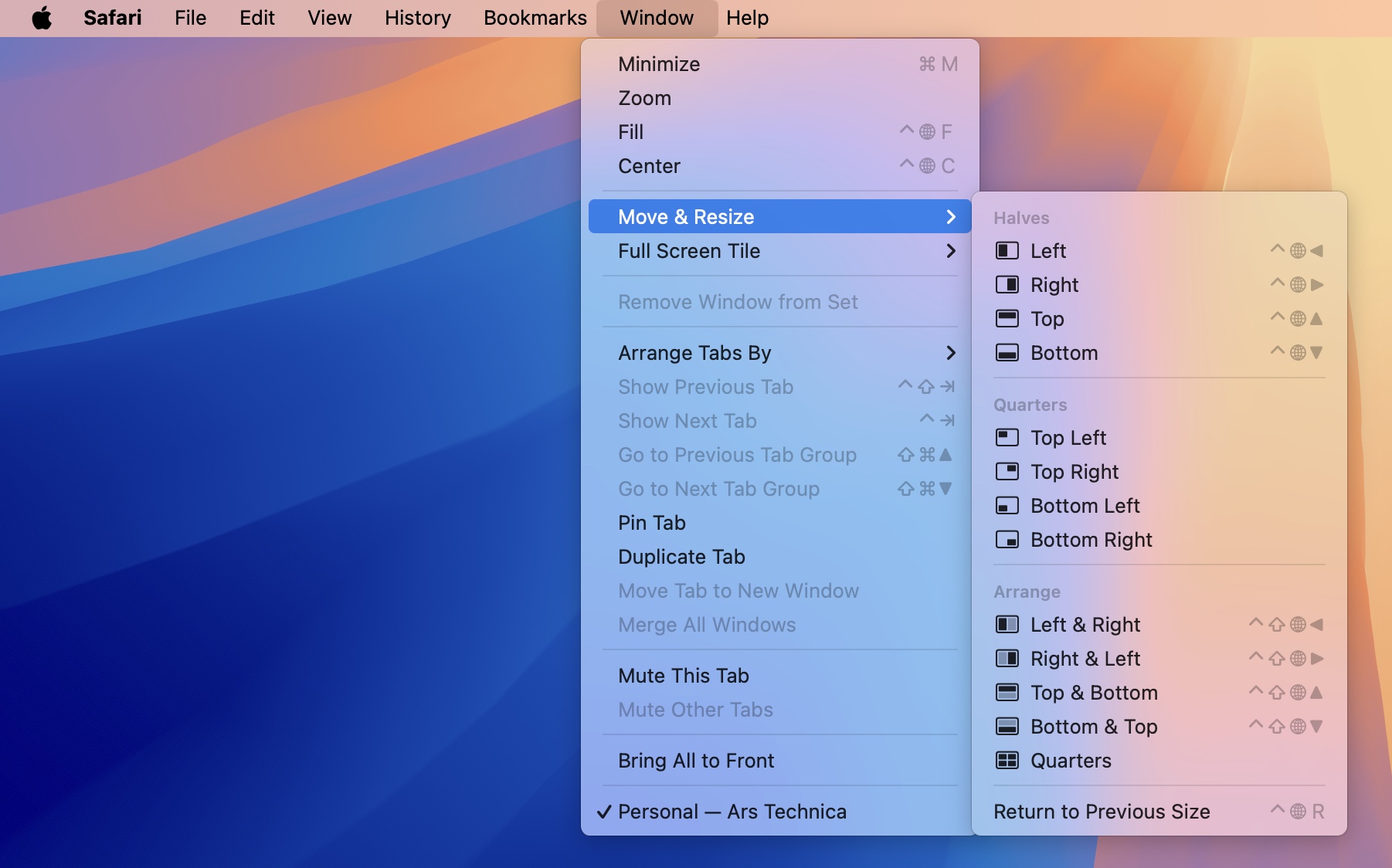
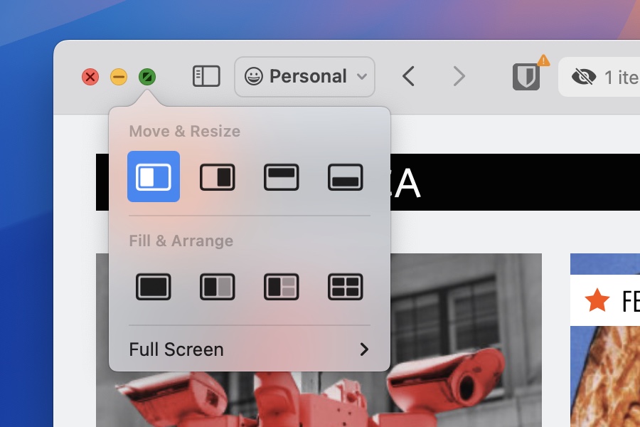


Comments